User Research & Design
Simplifying Asthma Care
9000
Patients
+
1200
Providers
+
At the Swedish health startup Medituner, I was one of two designers building a suite of asthma self-management tools. I wore many hats, designing the patient app, physician web portal, and brand system, as well as running user research. This case study runs through one project, the redesign of the core Symptom Tracking feature in the app.
Company
Medituner
Role
Lead Designer, Researcher
Design Team
Product Manager, Supporting Designer
Timeline
1 Month
Result
The redesigned symptom-tracking feature in the AsthmaTuner app improved clarity and consistency, resulting in 33% increase in user experience scoring (UEQ), enabling users to accurately document their asthma experiences and strengthening confidence in self-management within a chronic care context.

A couple using the AsthmaTuner app and spirometers.
The Problem
Recording Asthma Symptoms Is Clunky and Time-Consuming
Medituner is a digital health startup helping people with asthma live symptom-free. The app and companion bluetooth spirometer replace traditional diary-tracking and static treatment plans with tailored care based on regular self-testing.
While working at Medituner, I was tasked with improving the experience and design consistency of the old symptom tracking form. As users track their symptoms every day, some multiple times a day, it was critical for their experience with it to be straightforward and seamless.
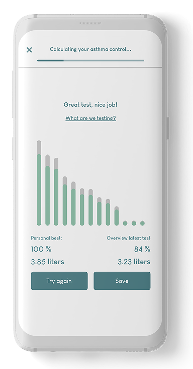
1) Test lung function
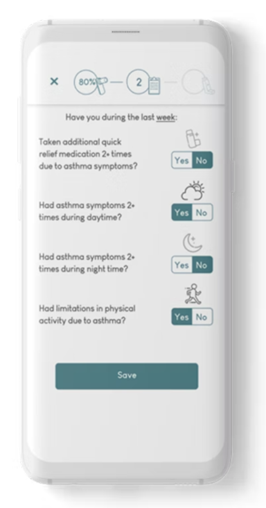
2) Record symptoms from past week
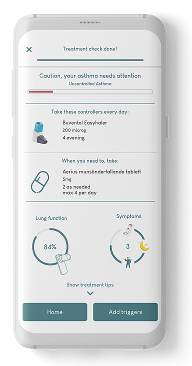
3)Tailored treatment recommendation
1. Lung Test
2. Record Symptoms
3. Treatment Results
AsthmaTuner treatment steps.
1. Lung Test
Take the deepest breath you can and breathe into the companion spirometer quickly and explosively.
2. Record Symptoms
Enter the symptoms you've experienced in the past week.
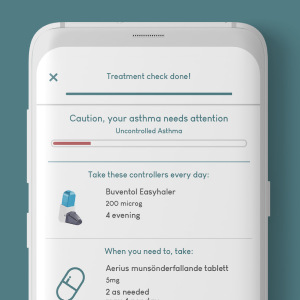
3. Treatment Results
Get your daily dosage recommendation based on your lung test and symptoms.
Requirements
The New Design Had To Improve Clarity and Comprehension
UI Face Lift
Update UI and other visual elements to get them on the same level/style as the rest of the app.
Improved Interaction Design & Error Prevention
Interaction must allow for fast answer selection with clear feedback, with flexibility to change answers
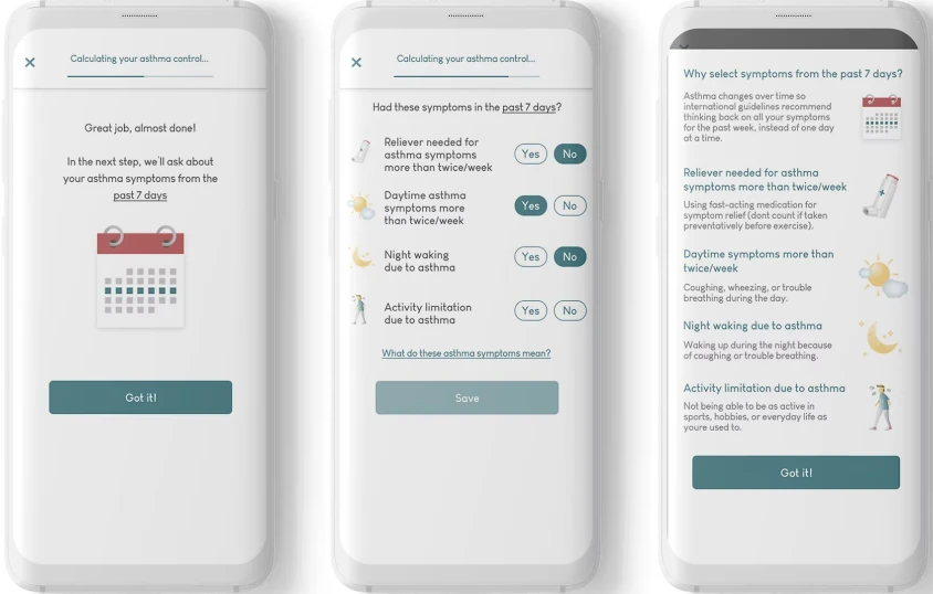
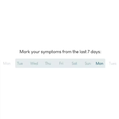
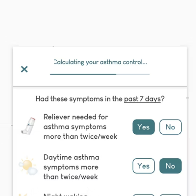
Emphasize 7 Day Timeline
Make clearer to the user that the timeline for the questions is the latest 7 days.
Simpler Questions for Young Users
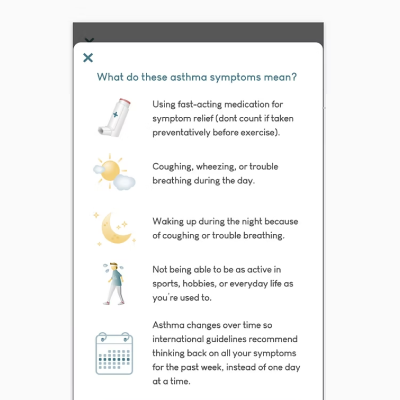
Phrase questions so they are simpler for children to understand - without being annoying to adult users.
Improved Education on Symptoms
Better inform the user about the effect symptoms have on the asthma control level.
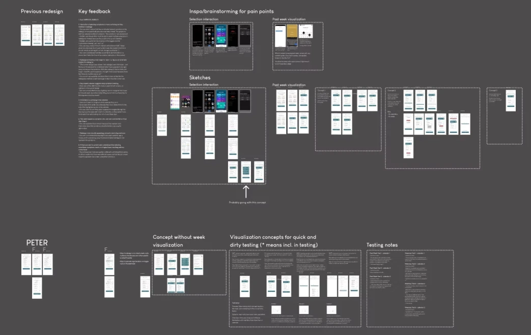
Ideation & Sketching
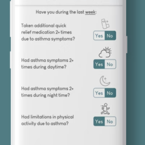
The First Version: Larger Buttons and A Clearer Timeline Element
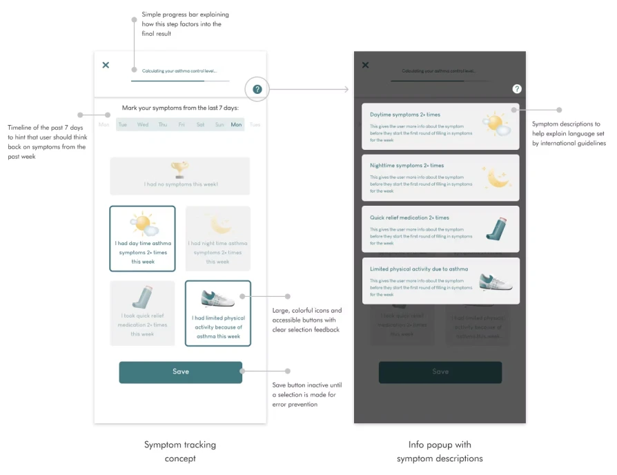
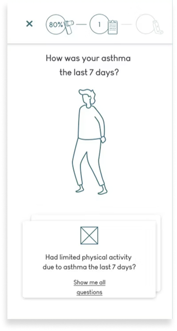
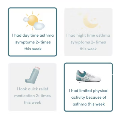
I iterated on several concept sketches and met with the team for feedback every few days. Out of the concepts explored, the final design included larger buttons for each individual symptom, a calendar aid for the timeline the user should think back on when documenting symptoms, and a simplified progress bar.
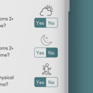
Other Design Concepts
Questions show up one at a time
Symptoms as single cards
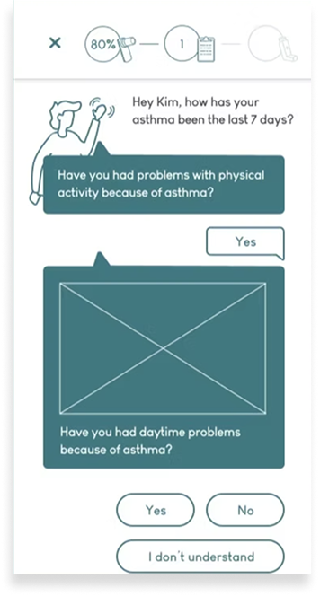
Chat format
Alternate button style & daily tracking timeline
AsthmaTuner user test.
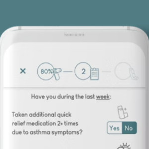
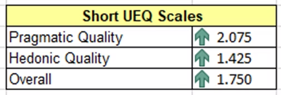
Risk Analysis Round 1
Testing Revealed Poorer Usability Compared to Old Design
As part of medical regulatory requirements, any design changes to treatment tools need to be evaluated for potential risks. Before the design got the green light, I had to prove that users understand and feel confident that they’ve correctly documented symptoms that align with their condition in the new design just as well as they do in the old design.
I expected the new design to perform better, but the results told a different story. The redesign was rated lower for pragmatic quality, which suggested poorer usability compared to the old design. I used this as a lens for analyzing the interview data, which shed light on confusing aspects of the design.
10 Participants
5 AsthmaTuner users, 5 non-users with asthma
1 Comparative Study
using hi-fi prototyping, UEQ-S questionnaire, and semi-structured interviews
Quantitative Results (Round 1)

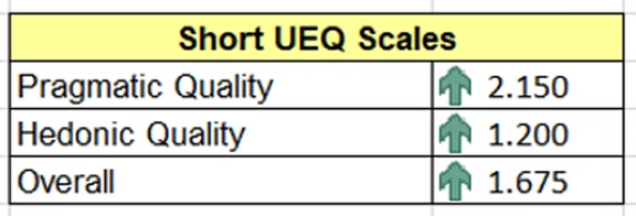
Original Design
More usable, less visually appealing.
Redesign
Less usable, more visually appealing.
Qualitative Results (Round 1)
Selecting Symptoms
Selecting symptoms is more confusing and less intuitive in redesign, but the design is more aesthetically pleasing.
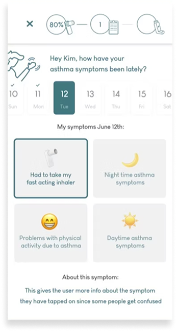
Calendar
Day-based visual calendar suggests daily symptom tracking, instead of weekly.

Education
The redesign takes longer to ‘learn.’
Back To The Drawing Board
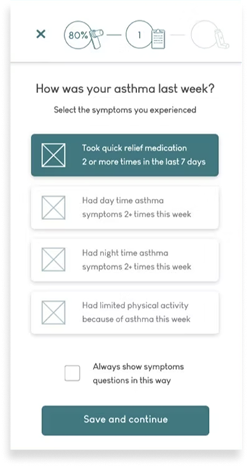
Refreshing The Old Design Based On Testing Feedback
There were no two ways about it: the new design wasn’t going to cut it. There were too many issues with elements of the new design for it to feel worthwhile to keep working with that concept. So, I went back to the drawing board.
I decided to take a second look at the original design and iterate on that instead, since it was still acceptable for users despite the weak points brought up in the original problem brief. Working with the feedback from testing, I integrated elements of the previous concept but kept the original visual structure.
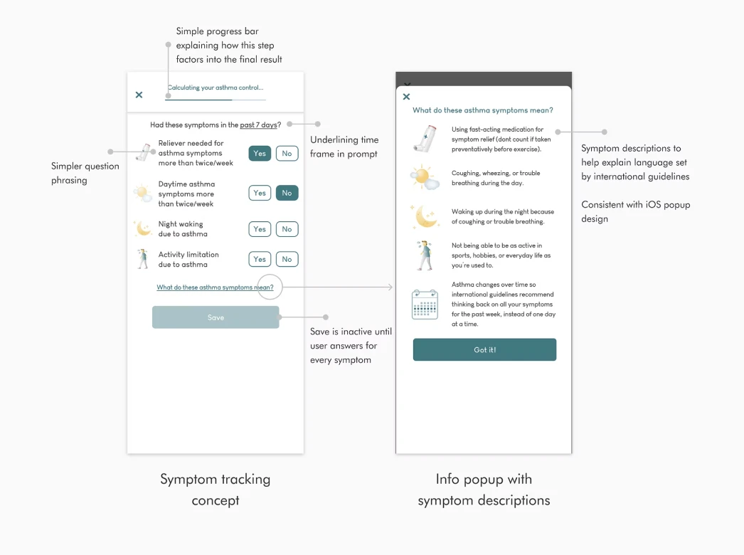
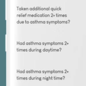
Post-testing concepting.
Risk Analysis Round 2
Second Design Iteration Performed Significantly Better in Testing
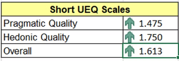
I ran the same comparative study to analyze the risk of releasing the new design. This time, the results significantly favored the new design, both on usability and visual appeal. Participants understood that they should document their symptoms from the past 7 days, and found the selection intuitive and quick.
10 Participants
5 AsthmaTuner users, 5 non-users with asthma
1 Comparative Study
using hi-fi prototyping, UEQ-S questionnaire, and semi-structured interviews
Quantitative Results (Round 2)
Original Design
Less usable, less visually appealing
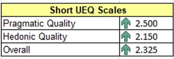
Redesign
More usable, more visually appealing.
Qualitative Results (Round 2)
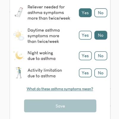
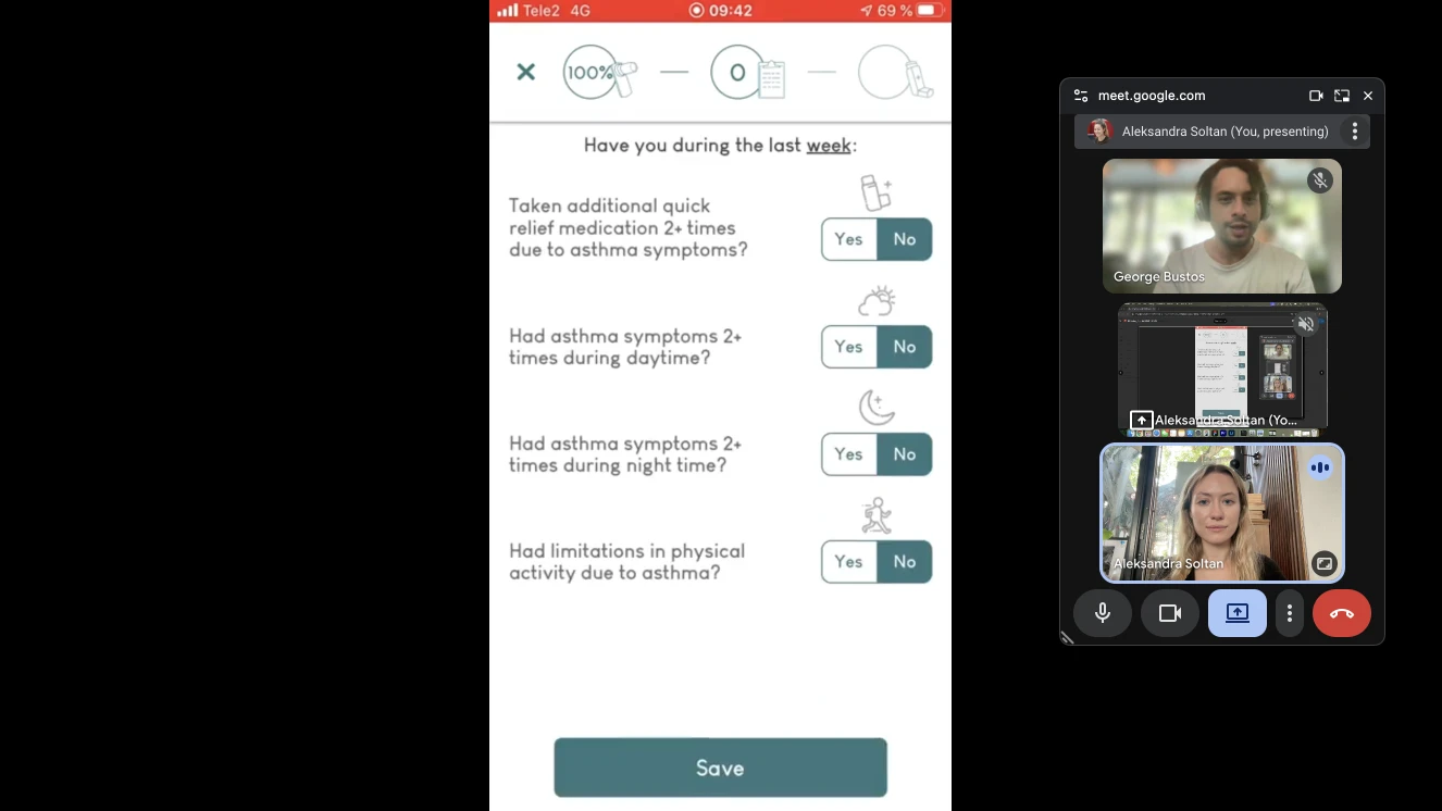
Selecting Symptoms
Selecting symptoms is more intuitive in redesign.
7-Day Prompt
“7-day” or “week” time frame correctly identified from prompt.
Education
Simpler symptom copy is easier to digest and understand. New icon design improves readability and symptom recognition.
Release & Outcome
A Clean and Consistent New Treatment Flow
After several design and testing iterations, we could confidently release a new design for symptom tracking in the AsthmaTuner app that helps our users accurately and capably document their asthma.
Additionally, our PM and CTO recognized that the risk analysis had been some of the most thorough they'd ever done for a new design, and AsthmaTuner has repeated the testing process for more releases since.
33%
improvement in user experience scoring (User Experience Questionnaire)
Takeaways

When Designing For Chronic Care, Read The Room
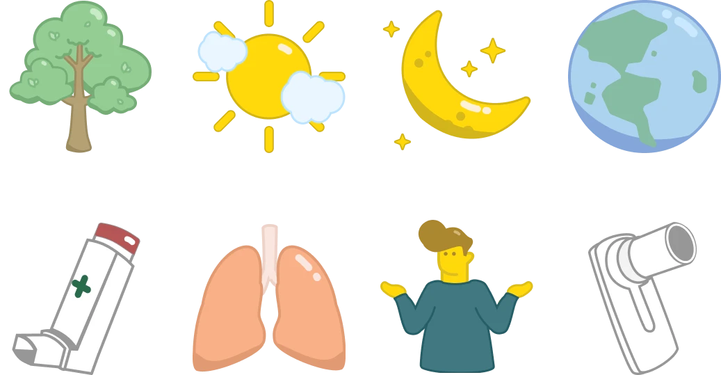
Icons I designed for the AsthmaTuner app
One of the more interesting insights coming out of this redesign was how different people with asthma prioritized functionality versus aesthetics in their care tools. Some research participants felt strongly that recording their symptoms was a chore that they wanted to get over with as soon as possible, so too many visuals became obstacles to their efficiency. Others enjoyed icons that brightened the experience, on top of improving comprehension for the symptom questions.
The results were in line with user behavior patterns I noticed while working at Medituner. While it would be a stretch to draw this conclusion from these studies alone, users did typically fall into one of two camps: they either hated to be reminded that they were sick, or had accepted their diagnosis and enjoyed experiences that made care more playful. Even later feature releases like a tree planting tracker for medication adherence received some criticism for making light of asthma management, despite being well-loved by many users. For people with chronic conditions who distance themselves from their illness, it may be challenging to engage with light-hearted experiences within their care.
As healthtech designers, it is critical that we understand the nuanced emotional experiences of all users. In UX it can be easy to default to ‘delightful’ solutions or make assumptions about lived experiences; however, everyone's relationship to their illness or condition is unique, and may change over time. It is ironic designing a product that people would prefer to not have to use, but truly catering to users means holding space for negative associations as well as positive ones.

Next Project
Building A Design Podcast