Branding & Strategy
Building A Design Podcast
64%
Traffic Conversion
2.5k
Monthly Impressions
This podcast is a personal project that I work on with fellow designer and long-time friend, Bella. It was born from a shared disdain for tech gatekeeping and convoluted jargon, and a shared passion for health design and advocacy. Everything from defining our mission to branding to editing the episodes is done by us. It is my pleasure to walk you through how ‘The Designer Will See You Now’ podcast came to be.
Company
The Designer Will See You Now (Personal)
Role
Co-Founder and Co-Host
Design Team
2 Designers
Timeline
1+ Years
Result
Through strategic branding design and thoughtful execution, including featuring leading voices in healthtech, the podcast has achieved a 45% month-over-month increase in listenership, reached 2.5K monthly impressions, and drove a 64% conversion rate from traffic to episode consumption.
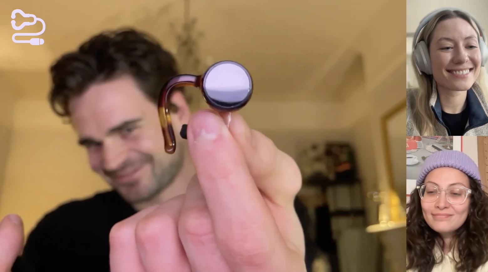
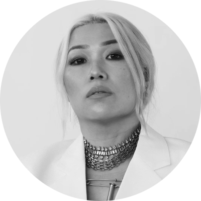
Episode 9, discussing Overtone hearing tech
The Idea
It Started At An Airport Terminal
I was sitting alone in an airport terminal on December 27th. Having gotten there way too early (predictably), I had nothing but time and my own thoughts. As one does at the fresh beginning of a new year, I thought about what I wanted to change.
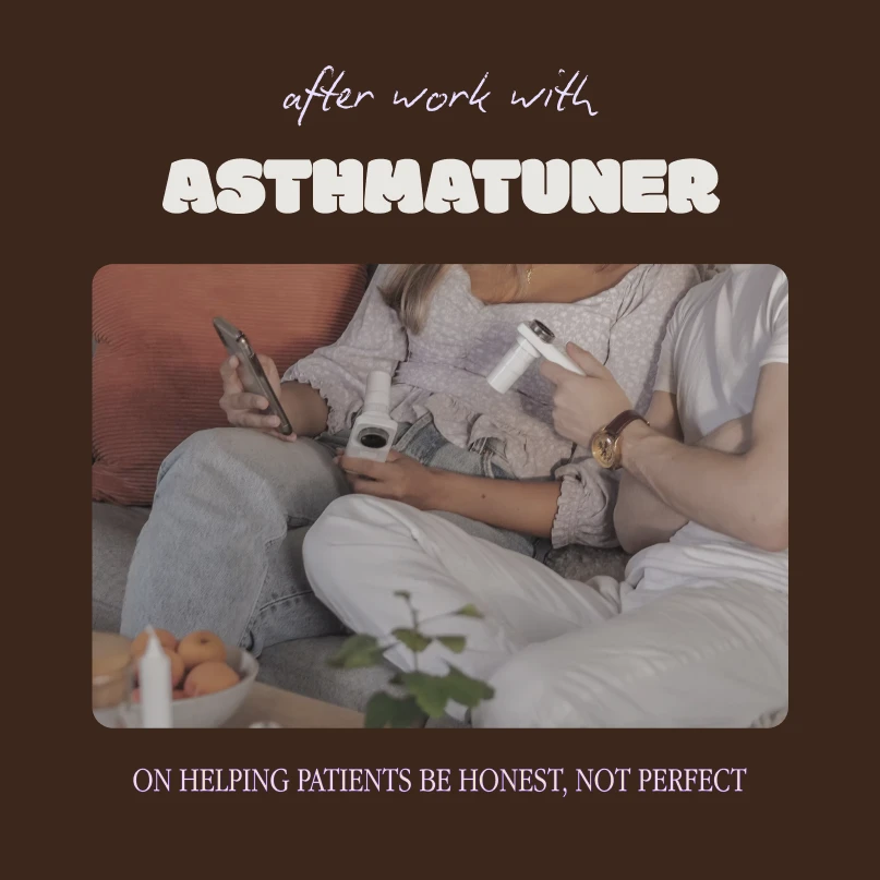
I had always announced a passion for healthtech as an integral part of my designer identity. This started when I did my first design internship at Medituner, an asthma management startup based in Stockholm. The nuanced, emotional experience of chronic care, the challenge of navigating regulatory complexity, and the fulfillment of helping people feel better sparked a new level of enthusiasm for my design work.
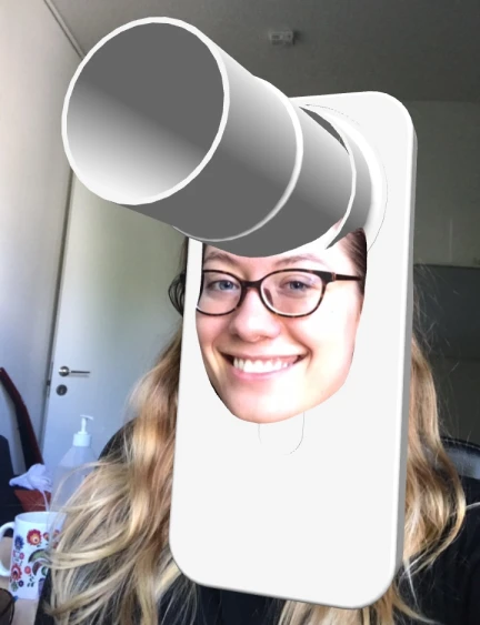
Passion for healthtech at work
(i.e. I made a spirometer-themed Instagram filter)
That enthusiasm didn’t diminish when I moved back to the US and got a new role at a design agency - but the outlet was gone. I was undoubtedly invested in my new work, but my self-definition as a ‘designer who is passionate about healthtech’ seemed to ring less and less true as the years went on. So, on December 27th, alone in Terminal E of Boston Logan, I decided to do something about it.
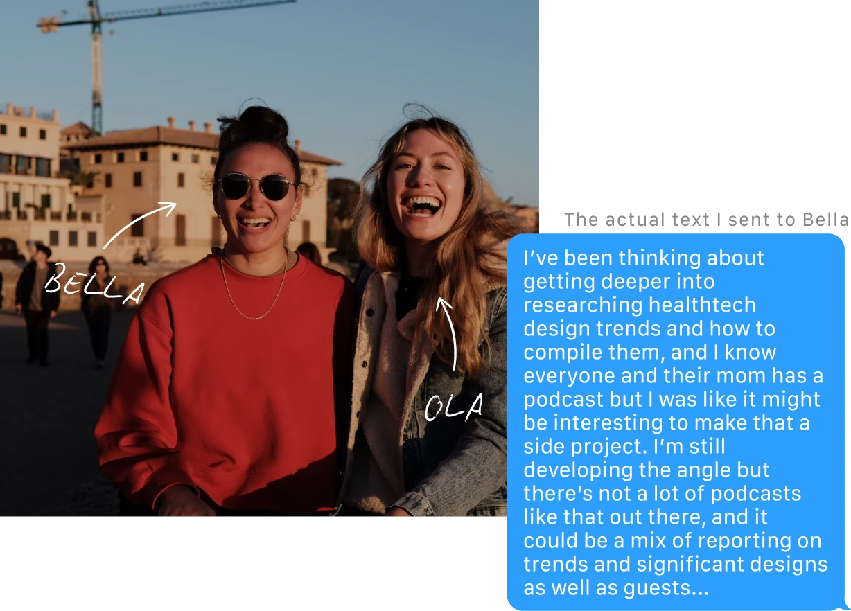
At Medituner, I was lucky to work with the incredibly talented Bella, and even luckier to end up becoming friends with her. Before boarding, I sent her a text pitching the idea of co-hosting a healthtech podcast. The way I saw it, if I wasn’t actively working in healthtech at the moment I could at least interview and learn from people who were. By the time I landed, I had a response: Bella was down. From there, I sent her a brain-dump Figjam board of my vision and we were off to the races.
Tone & Name
Bella and I knew from the beginning that we wanted to make a podcast that felt like pulling up a chair with friends who are passionate about what they do: less clinical tech conference, more ‘after work’. We believe in inspiring others with the opportunities in healthtech, not gatekeeping it with unnecessary jargon.
Our Guiding Pillars
Advocacy
Twofold: shining a light on inequity in the medical and design space, and informing patients for greater self-advocacy.
Human-Centered
Analyzing healthtech solutions through the lens of behavioral science and co-design.
Credibility
Grounding any hot takes in foundational UX principles, research, and insights from medical professionals.
In line with that, we wanted our title to be playful and approachable, and intentionally avoided clinical language like tech, medicine, med-tech, medical, device, health, health-tech, pharma, doctor, and nurse. Ultimately we landed on "The Designer Will See You Now," a twist on the classic waiting room call: 'The doctor will see you now.'
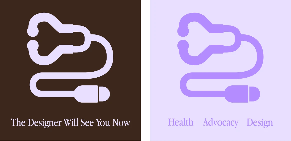
"The Designer Will See You Now"
Logo
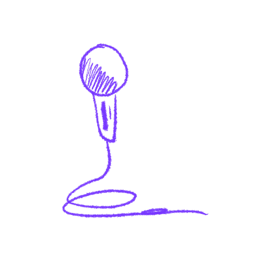
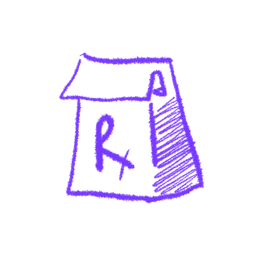
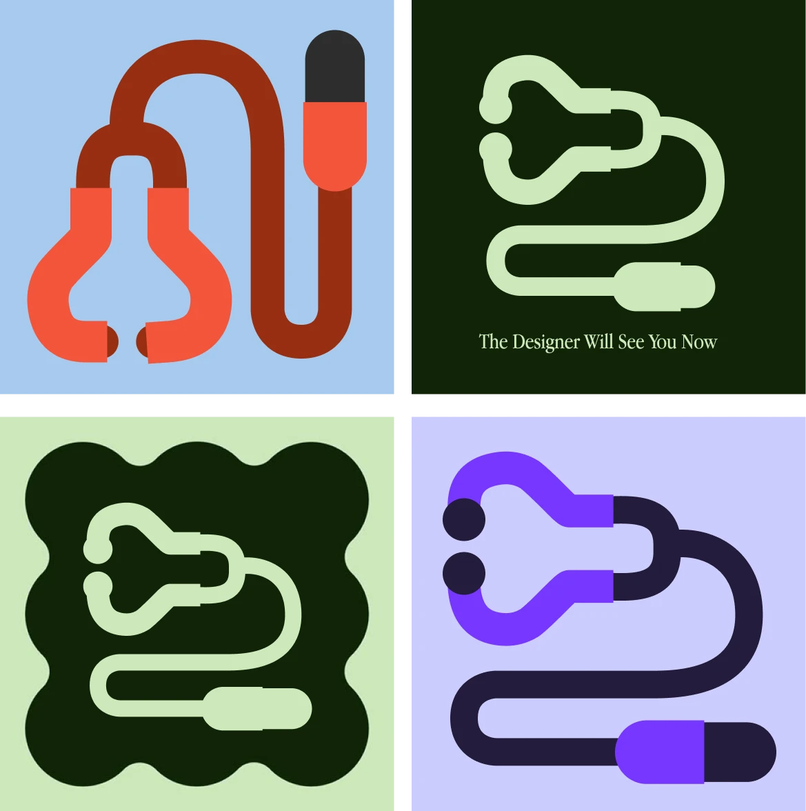
We took a similar approach to the logo design as the title: referencing healthcare but abstracting away enough that it didn’t feel overly clinical. We drew inspiration from old medical textbook covers and diagrams, especially the use of geometric elements and vector-style illustration.

A stethoscope is a sort of 'communication device' between the patient and provider - but instead of words, the provider is listening to the patient's heart. Following this idea, we noticed that the end of a stethoscope almost looked like a microphone. This gave us enough of a lead to explore a combination of the two tools.
Initial logo explorations
The final logo is a flat design that alludes to the shapes of the stethoscope and microphone without being explicit, inviting the viewer to analyze it past first glance.
Primary Logo
Secondary Logo
Tertiary Logo
Color Palette
The color palette came quickly, in large part thanks to Bella. Bella’s background is Filipino, and she had previously explored a palette for a separate project that drew on colors present in Filipino cuisine (such as purple from taro). She very generously offered the palette as the foundation from which we pulled the podcast brand colors.
We ran a small survey to gauge perceptions of the color palette and logo, and received positive feedback with participants describing the branding as "feminine" and "approachable."
Primary Palette
Light Purple
Hex: #E9DEFF
Brown
Hex: #3B271C

Off-White
Hex: #E9E6E2

Dark Purple
Hex: #7737FF
Secondary Palette

Medium Purple
Hex: #B38CFF

Dark Green
Hex: #1D380D
Light Green
Hex: #BFCDAC
Typography
The typography had to walk a fine line between playful and credible; however, because this was a personal side project we could also play with pushing boundaries and choosing bolder fonts than we might opt for in client designs.
Header Typeface
MODAK
Rather than playing it safe, headers stand out with bubbly Modak. From the get-go its boldness distinguishes the podcast from other healthtech brands.
Sub-Header & Primary Body Typeface
Apple Garamond
Sub-headers and primary body copy use the toned down Apple Garamond. Its serif type and recognizability balance some credibility against Modak’s distinctiveness.
Accent & Secondary Body Typeface
Biro Script Reduced
Biro Script Reduced is an accent type added in as a nod to ‘doctors’ notes’, providing a hand-made feel that supports the natural texture of the art direction.
Art Direction
The art direction for episode covers and social media marketing draws heavily from natural, layered textures, like what you might find in doctor’s notes and medical charts. The intention is to communicate the humanity and authenticity behind healthtech, instead of a polished, clinical facade.
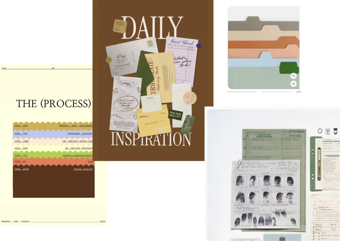
Art direction inspiration
The covers below are examples of templates for our 3 episode types: Guest Interviews, 'After Work' Design Reviews, and Trend Discussions.
How It's Going
'The Designer Will See You Now' Podcast
On May 5, 2025, we launched our very first episode, 'Meet the Hosts.' Since then, we’ve dropped monthly episodes discussing all things healthtech design - from breaking down language barriers in healthcare to the insidious power of stigma in patient experiences. We’ve had the pleasure of interviewing industry leaders and fellow designers, and walk away from every conversation inspired by their commitment to advocacy, equity, and making what they want to see in the world.
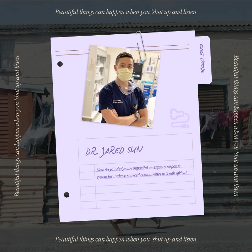
Our mission is to make healthtech accessible for others, but beyond that this project has been a deeply rewarding personal learning experience. There have been moments that surprised me, like when assistive tech designer Nick Morgan-Jones referenced that on average, people who are diagnosed with a hearing disability go 7-11 years (!) before using a hearing aid (often due to stigma). Other conversations affirmed my own design principles, such as when Dr. Jared Sun attributed his success in training over 10,000 first responders across South Africa to one simple co-design approach: “Shut up and listen.” Each episode challenges me to continually expand my approach to health design, taking into account a wide range of use cases, approaches, and vulnerable user groups.
Listen on SpotifyListen on Apple Podcasts
Aside from the content, launching the podcast has been a valuable exercise in marketing as well. Currently, we post a variety of content across LinkedIn and Instagram, with a combination of video clips and text-based posts. While our reach is growing, we plan to roll out a wider social media strategy leveraging grassroots marketing and long-form educational content on platforms like Medium and Substack.
By The Numbers
45%
month-over-month increase in listenership
2.5k
monthly impressions across all platforms
64%
conversion from traffic to consumption
We've been lucky to have a line up of guests who are not only industry leaders and founders, but also embody the podcast's pillars of advocacy and human-centerdness. As our reach grows, securing guests becomes easier; however, it is still an exercise in networking and pitching how our vision aligns with theirs. Connecting with fellow designers and medical professionals who are passionate about what they do inspires us to consider how our own work can have a greater positive impact.
Recent Guests
Listen to Episode
Nick Morgan-Jones
Stigma-busting product designer and founder of Overtone hearing tech
Listen to Episode
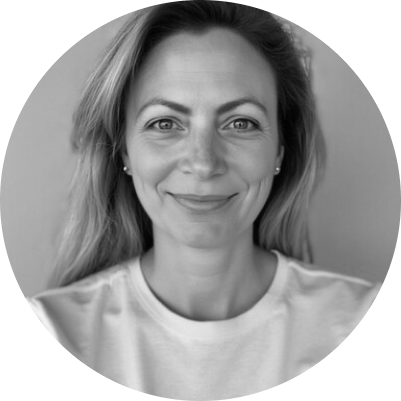
Maja Magnusson
CEO of Care to Translate, an app breaking down language barriers in healthcare
Next Project
The First Amex Travel App