Strategy & App Design
The First Amex Travel App
3000
Properties
+
512
Benefit Combinations
I joined the American Express design team when the concept of a travel app was just being formed. 1.5 years later, it was launched to the public. I have had the pleasure of building this project from the ground up with an immensely talented design team, collaborating on the big-picture strategy, the in-the-weeds design work, and the user research. This case study is a small snapshot of the complexity of this undertaking, through the lens of key purchasing decision points in the hotel booking flow.
Company
American Express
Role
Senior Product Designer
Design Team
8 Designers
Timeline
1.5 Years
Result
Successful American Express Travel App launch, delivering a personalized, mobile-first booking experience that increases user confidence and engagement in travel purchases while advancing Amex’s digital product strategy.

Amex promotional material showing Platinum Card.
The Problem
Without An App, American Express Was Falling Behind
Today’s travelers expect a seamless, best-in-class booking experience, and without a mobile app, Amex Travel was falling behind. While Card Members could book on the web, the experience wasn’t optimized for confident mobile purchasing.
Card Members value exclusive benefits and want to maximize their points, viewing their cards as part of a lifestyle - not just a payment tool. Research showed a strong focus on stretching points and fully using benefits.
When tasked with designing the first ever Amex Travel App, the team faced an intricate challenge: simplifying the complexity of multiple inventory sources, dynamic pricing, and hundreds of benefit combinations into a clear and transparent experience. Given existing skepticism around transparency and whether Card Members were getting the best deal, our solution had to support confident booking decisions and build Card Member trust.
The Complexity At A Glance
American Express
12
travel credit card products
3000+
properties across 114 countries
512+
possible benefit combinations per hotel
The Strategy
Three Pillars To Guide Design
Our goal was to give Card Members the information they needed to choose hotels and use points effectively. Behind the scenes, this required integrating multiple inventory sources and handling hundreds of benefit combinations, while the frontend focused on presenting this complexity in a clear, contextual, and transparent way.

Contextual and Relevant

Provide Card Members with a curated & personalized digital experience by dynamically adjusting content.

A Unified View
Create a consistent design language for easily browsable information around the booking options. Integrate partnerships, benefits, and offers into a comprehensive, seamless experience.

User-Centered Transparency
Accessibility and user-centric thinking are top priority, especially in regards to trust around pricing and deals and clarity on checkout.
User Story
As a Card Member, I want to trust that I have all the information I need to get the best deal and make the most of my benefits.
The Design Process
Tackling An App From Scratch
Designing an app of this scale required prioritizing key features based on Card Member survey insights and delivering them across two-week sprints. Booking flows for cars, hotels, and flights were initially designed separately, then refined iteratively as patterns emerged. An agile approach enabled the team to revisit and improve designs without letting them become outdated (annotations were a lifesaver here!).
Each new feature began with an exploratory phase, allowing designers to research, ask questions, and generate concepts. This included competitive analysis across travel, finance, and adjacent apps to understand user expectations (Jakob’s Law), while also driving early cross-functional alignment. The process then moved into a delivery phase, where selected concepts were refined, edge cases addressed, and designs prepared for handoff to development.
The Solve
Building Trust At Key Moments In The Booking Flow
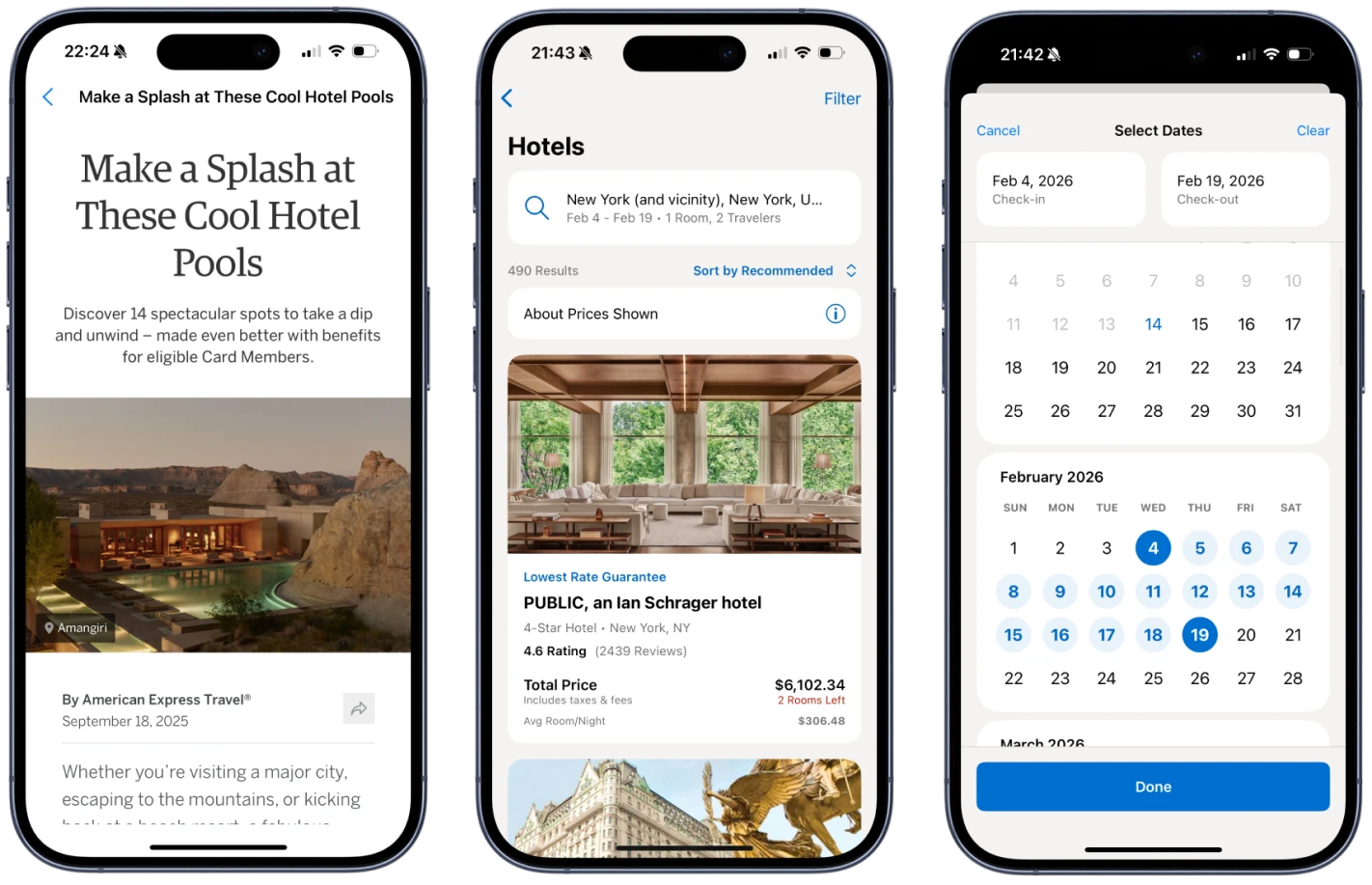
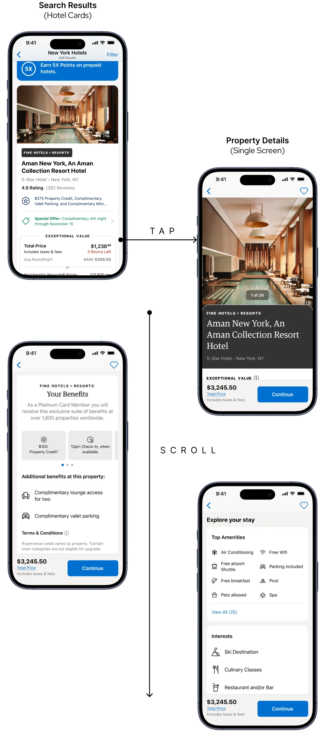
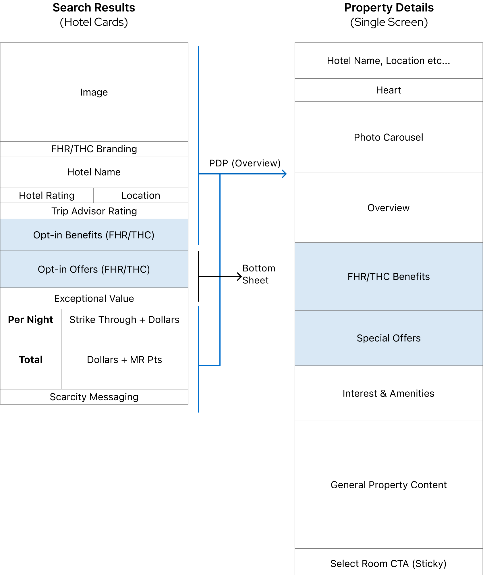
This section explains how the hotel booking flow supports the Design Strategy pillars - Contextual and Relevant, A Unified View, and User-Centered Transparency - across the search cards, detail page, and checkout. These moments represent the user’s key decision points, from initial selection to confidently locking in a final booking.
Every feature was user-tested before release, using unmoderated, task-based studies on UserZoom. Screening criteria were applied to target a specific participant segment, ensuring we gathered meaningful insights from users experienced in booking travel.
Contextual and Relevant
Smart Progressive Disclosure
Universal booking determinants (Price, Location, Reviews) are balanced with dynamic, card-specific benefits. Too much information clutters the card, so benefits and offers are layered into the flow contextually via progressive disclosure.

Usability tests showed the cards were clear and effective, but users struggled to understand hotel program labels like “Fine Hotels & Resorts.” Adding benefit context on the PDP helps bridge this gap, even if it requires an extra tap.
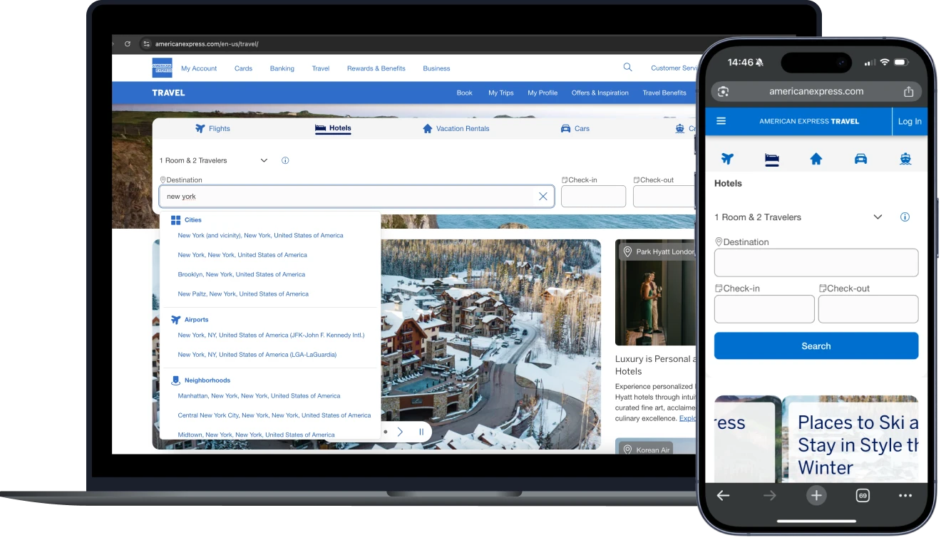
A Unified View
Guided Scanning
A clear visual hierarchy improves browsability by directing attention and helping users prioritize information. Interaction is simple, with a single tap target per card, while limited use of color and iconography creates a consistent and recognizable design language for quick hotel comparison.
User-Centered Transparency
Leading With Price Clarity
Despite limited space and marketing input, the design leads with user needs by emphasizing price clarity in both dollars and points. Benefits are integrated organically to inform decisions without feeling like an upsell.
When asked to place 7 key elements in order of priority when searching for a hotel, test participants listed (1) Location, (2) Price, and (3) Reviews as most important.
Contextual and Relevant
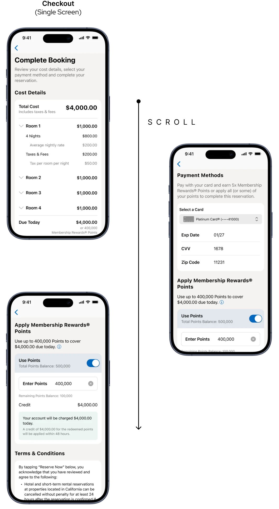
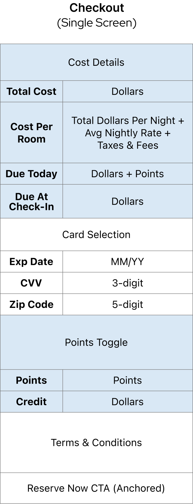
Personalized Checkout Logic
The checkout adapts to the user’s card, points balance, and payment preferences. Card details are pre-filled, points options only appear when relevant, and the cost breakdown updates based on Pay Now or Pay Later selections, showing items like deposits or amounts due at check-in.
A Unified View
Keeping It Clean
A clean, minimal layout makes it easy to review costs and choose payment methods. Consistent headers improve scannability, while icons, toggles, and color are used sparingly to highlight key actions and important details.
User-Centered Transparency
Trust Through Transparent Pricing
A detailed price breakdown and a non-default points toggle prioritize user confidence over business incentives. This approach reflects feedback that forced points usage created discomfort and reduced trust.
A previous version of the design had points toggled-on by default, and usability test participants who noticed this were concerned about mistakenly using their points.
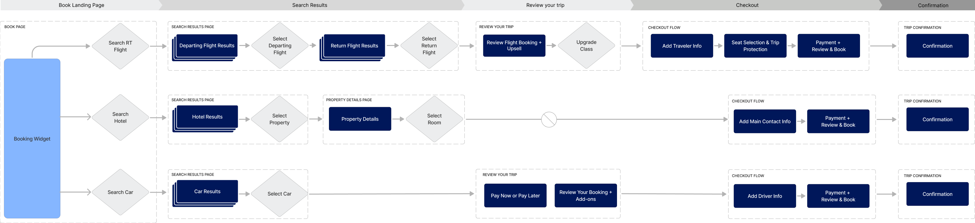
The Mapping
Accounting For All States
For designs with numerous permutations based on card type, benefits and offers, hotel type, and payment methods, all happy paths, edge cases, and errors needed to be accounted for. The result was development-ready files with hundreds of annotated screen states and component sub-states.
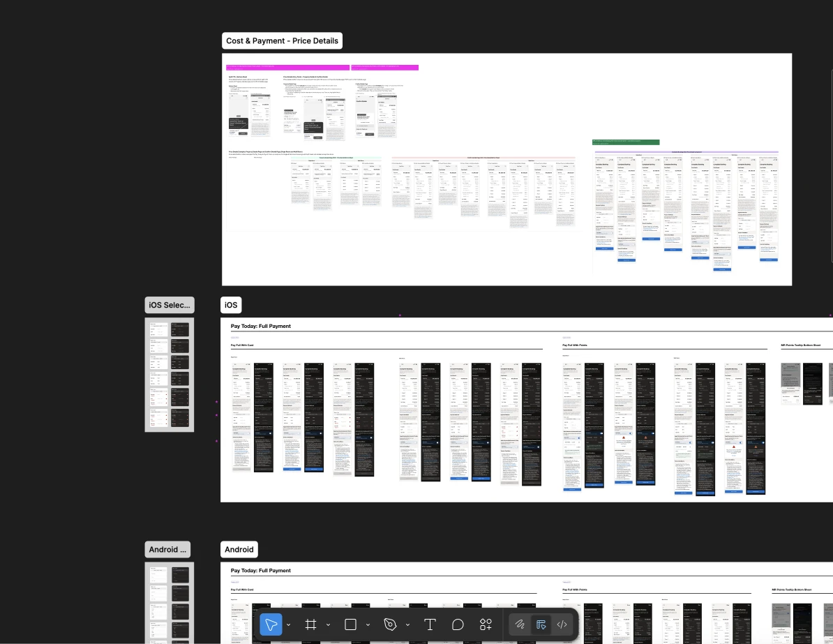
Checkout Final Screens
Release & Outcome
The First Amex Travel App
After 1.5 years of planning, design, research, and development, the first Amex Travel App launched in September 2025. This was a milestone in Amex's digital transformation, showing a commitment to providing a booking solution that empowers Card Members to make informed but efficient purchase decisions.
Open in App StoreTakeaways

Data Isn't King - Storytelling Is

This project emphasized the importance of clearly understanding what information matters most to users and aligning stakeholders on how to balance that with business priorities. It required not only data-driven decisions from research and surveys, but also translating that data into a strong narrative about how users move through key decision points.
For the hotel search cards, it wasn’t enough to say users prioritize price, location, and reviews. For example, discussions around benefits education within the hotel search cards went beyond simply stating that Card Members prioritize price, location, and reviews. While research supported elevating these factors, the business perspective rightly emphasized the premium value of American Express benefits and questioned whether they should be more prominent earlier in the experience. Alignment came from defining the purpose of each step in the journey: search results support quick comparison, while the property details page enables deeper exploration and benefits education.
Ultimately, the data alone was not sufficient. Progress depended on crafting a compelling narrative that demonstrated how highlighting Amex’s unique benefits later in the funnel better served both user needs and business goals. This alignment between research insights and strategic storytelling was critical to achieving stakeholder buy-in and delivering a more intentional, user-centered experience.

"Booking reward travel just got easier...As a companion to the main American Express app, the travel app is designed to make it easier for users to book both reward travel with Membership Rewards points and regular travel."

"For decades, American Express has been synonymous with premium service and trusted advice. Now, with the launch of its first-ever dedicated travel app, the brand is aiming to bring that same reliability to the palm of your hand."

Amex Travel App promotional material
Next Project
Simplifying Asthma Care